ILT List Element
This guide provides detailed instructions for using the ILT List Element in Construct, including its settings, properties, and metadata.
Overview
The ILT List Element allows users to create ordered or unordered lists for use in both ILT and Word outputs. This document explains the settings and options available for customizing lists.
Requirements
- Access to the Construct platform.
- Administrator or content editing permissions.
Element Settings
General
Locked
The Locked checkbox, labeled Lock this and children, secures the content item and its associated nested elements.
Children refers to elements nested within others, such as:
- Elements under Key Learning Points (KLPs),
- KLPs under Teaching Points (TPs),
- TPs under Learning Objects.
 Figure 1: Locking Function
Label
The Label field creates a unique identifier for the content item, used for debugging and auditing purposes.
- Clicking the return icon resets the label to the default text: "New Component Title".
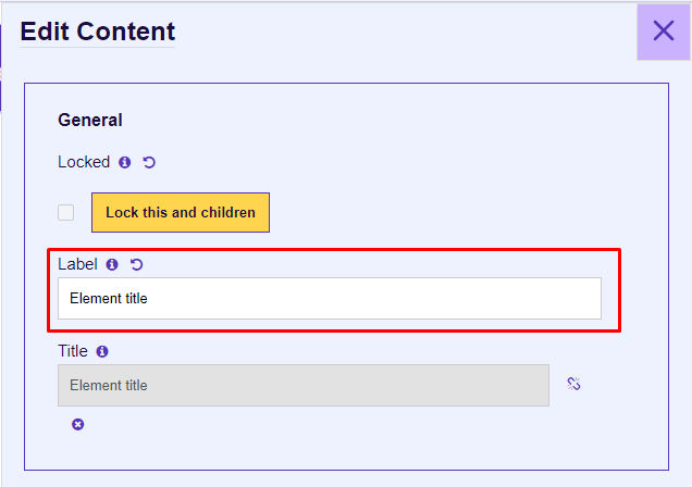 Figure 2: Label Input
Title
The Title field specifies the display title of the content item, shown in the Presentation view and Word outputs.
- By default, the title is linked to the Label. You can unlink it by clicking the chain icon.
- The Title can be left empty, and it takes the KLP Title in Presentation and Instructor/Student views.
 Figure 3: Title Input
Properties
Preceding Text
This section is used for creating introductory text for the list.
 Figure 4: Preceding Text Area
For CKEditor controls, refer to the CKEditor Controls.
List Type
The List Type dropdown allows users to select the list format:
- Blank: Unordered, without numbering or bullets.
- Letters: Ordered by letters.
- Bullets: Unordered, with bullets.
- Numbers: Ordered by numbers.
 Figure 5: List Options
Starting Number
The Starting Number field defines the starting number for numbered lists, defaulting to 1.
 Figure 6: Starting Number
List Items
To add list items:
- Click the Add button.
- Enter the content in the Item Text CKEditor input box.
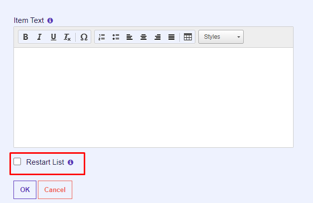 Figure 7: Item Text
Restart List
The Restart List checkbox breaks the list into a new slide in the presentation window.
For this functionality, ensure the Bullet Build checkbox is also selected.
 Figure 8: Restart List
Proceeding Text
This section is used for adding text following the list.
 Figure 9: Proceeding Text Area
Is Aggregation?
The Is Aggregation? checkbox aggregates titles of TP elements with the Aggregation option checked and displays them as a list.
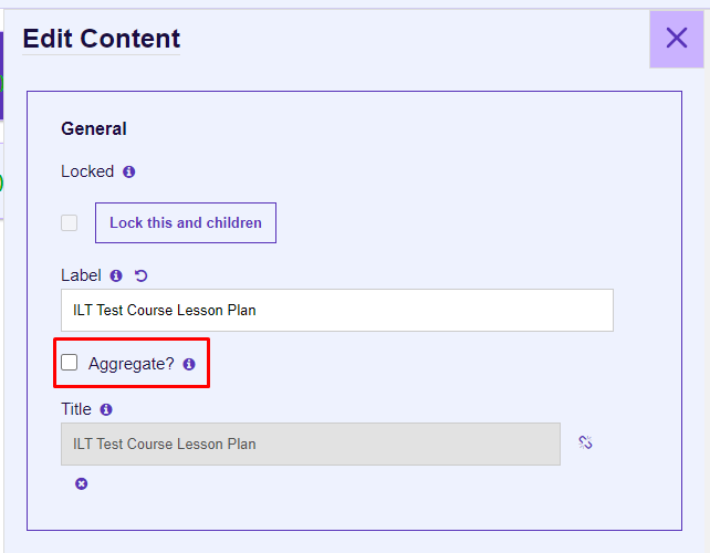 Figure 10: Is Aggregation
 Figure 11: Aggregation Display
Is Bullet Build?
Selecting the Is Bullet Build? checkbox displays one bullet point at a time during presentation interactions.
 Figure 12: Is Bullet Build
Background Image
This option allows users to add a background image for the objectives slide in the presentation student window.
The image must have reduced opacity before uploading, as the Construct system does not automatically reduce opacity.
- Click Select an Asset to choose or upload an image from the Asset Library.
- The Select an External Asset button is currently non-functional.
 Figure 13: Background Image
Output Types
ILT (Instructor-Led Training)
When ILT is selected, users can specify ILT Settings:
- Instructor: Displays the element in the instructor presentation window (text and list components only).
- Student: Displays the element in the student presentation window.
 Figure 7: ILT Output Types
Word
When Word is selected, users can specify Word Settings:
- Student Notes: Includes the element in the Student Manual output.
- Instructor Guide: Adds the element to the Instructor Guide and the instructor presentation window (text and list components only).
 Figure 8: Word Output Types
Metadata
Job Roles
Use the Job Roles dropdown to assign roles.
- Accessible via: Hamburger menu > Administration > Metadata.
 Figure 9: Job Roles Metadata
Other Metadata
The Other Metadata button allows for custom metadata, primarily used during migration.
 Figure 12: Other Metadata
Save Changes
Important: Always click Update to save changes. Unsaved changes will be lost upon exit.
To discard changes, click Cancel or the purple X button.
 Figure 13: Update and Cancel Buttons